The common approach to athletic monitoring focuses on visible outputs like distance covered or speed. This is a fundamental error. The true future of performance optimization lies in decoding the invisible language of kinetic efficiency. This guide reveals how next-generation sensors quantify the hidden metabolic cost of movement, identify micro-errors in technique, and analyze load tolerance to predict fatigue signatures long before an athlete’s conscious perception, shifting the focus from tracking what was done to understanding how it was done.
For the data-obsessed coach or athlete, the promise of wearable technology has always been to replace subjective feelings with objective metrics. We’ve moved past simple step counters and rudimentary heart rate graphs. Yet, a fundamental flaw persists in how most performance data is interpreted. The industry remains fixated on vanity metrics—total distance, peak velocity, number of repetitions. These are outputs, the “what” of performance. They tell a story, but it’s an incomplete one, often masking the onset of true, systemic fatigue.
The conventional wisdom is to track more data points, creating ever-more-complex dashboards. This often leads to “dashboard blindness,” a state of information overload where crucial signals are lost in the noise. The real paradigm shift isn’t about collecting more data; it’s about asking more intelligent questions of it. What if the key to unlocking peak performance and preventing injury isn’t in measuring the magnitude of an athlete’s effort, but in quantifying its efficiency? What if we could detect the subtle breakdown in biomechanics that precedes a drop in performance or an injury?
This is the new frontier of sports technology. It moves beyond raw output to analyze the underlying kinetic signature of an athlete. It’s about measuring the metabolic cost of every acceleration, the precision of every movement, and the body’s true tolerance to load. By decoding this invisible language, sensors can now identify fatigue at a cellular and biomechanical level, often hours or even days before the athlete “feels” tired. This analysis provides a predictive edge, transforming training from a reactive process to a proactive strategy.
This article will deconstruct the core principles of next-generation performance analysis. We will explore why traditional metrics fall short, how to correctly deploy sensor technology for accurate data capture, and how to interpret advanced load metrics to make smarter, data-driven decisions that truly optimize kinetic output.
Summary: Decoding the Invisible Signatures of Athletic Fatigue
- Why “total distance” is a vanity metric compared to “high-speed distance”?
- How to position IMUs (Inertial Measurement Units) for accurate jump height data?
- GPS Vests vs. Camera Tracking: Which is more accurate for indoor sports?
- The “dashboard blindness” risk: Focusing on too many metrics at once
- When to use load metrics to clear an athlete after injury?
- Why “hitting balls” is not training unless you measure accuracy?
- Why wrist-based heart rate monitors fail during HIIT (and what to use instead)?
- Can Digital Analysis Spot Micro-Errors Invisible to the Naked Eye?
Why “total distance” is a vanity metric compared to “high-speed distance”?
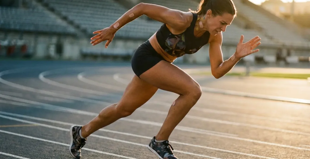
The obsession with “total distance covered” is one of the most persistent and misleading paradigms in team sports analytics. It treats all movement as equal, failing to differentiate between a low-intensity jog and a series of explosive, direction-changing sprints. While high-speed distance is a step forward, even it doesn’t capture the full picture. The true measure of an athlete’s work is not distance, but metabolic cost—the actual energy expended to perform an action. Accelerating, decelerating, and changing direction are far more metabolically taxing than running at a constant speed, yet traditional metrics often ignore them.
To truly understand an athlete’s load, we must shift our focus to metabolic power. This metric, calculated from GPS and accelerometer data, quantifies the energy consumption rate at any given moment. It reveals the physiological impact of an athlete’s efforts, providing a much more accurate indicator of fatigue. For instance, research from 2017 demonstrates a 41% greater time at high power than high speed during multi-directional running. This means an athlete can be accumulating significant fatigue even when not moving at top speed.
This visualization conceptualizes the difference. The steady-state runner on the left represents the simplistic “distance” metric. The athlete on the right, engaged in explosive drills, represents the high metabolic cost that truly defines athletic workload. By focusing on metabolic power zones, coaches can manage load with far greater precision, understanding the true cost of a training session rather than just its volume. This shift from measuring output to quantifying cost is fundamental to modern performance management.
How to position IMUs (Inertial Measurement Units) for accurate jump height data?
Inertial Measurement Units (IMUs) are the core of most modern wearables, combining accelerometers, gyroscopes, and sometimes magnetometers to track movement in three-dimensional space. While they can provide a wealth of data, their accuracy is critically dependent on a factor often overlooked: placement. For quantifying a specific metric like vertical jump height, incorrect positioning can render the data completely useless. The goal is to measure the displacement of the athlete’s center of mass, not the flailing of a limb.
Placing an IMU on the wrist or ankle to measure jump height is a common error. These distal locations introduce significant “noise” from limb rotation and secondary movements, which the sensor’s algorithm can misinterpret as vertical displacement. The force of an arm swing or the flick of an ankle can create acceleration spikes that have little to do with how high the body’s center of mass actually traveled. This results in inconsistent and often inflated readings that are not biomechanically valid.
For the highest fidelity jump height data, the IMU must be positioned as close to the center of mass as possible. The scientifically validated location is on the upper sacrum or the L3-L5 region of the lower back. Placed here, typically secured with a dedicated belt or integrated into a vest, the sensor is stabilized on the athlete’s core. This minimizes the influence of limb movements and allows the accelerometer to cleanly capture the vertical acceleration profile of the torso from takeoff to landing. It is this clean signal that allows for the accurate calculation of flight time and, consequently, a reliable jump height metric.
GPS Vests vs. Camera Tracking: Which is more accurate for indoor sports?
The challenge of tracking athletes indoors is a significant hurdle for many sports. Global Positioning Systems (GPS), the technology powering most outdoor tracking vests, are fundamentally reliant on receiving clear signals from multiple satellites. Indoors, this connection is lost, rendering GPS-based systems highly unreliable or entirely non-functional. This has led to the adoption of two primary alternatives: optical camera tracking and Local Positioning Systems (LPS). While both offer solutions, their accuracy and limitations differ significantly.
Optical camera tracking, using multiple high-speed cameras placed around an arena, can offer millimeter-level precision in positional data. However, its primary weakness is occlusion. When players are tightly grouped, the system can lose track of an individual, creating gaps in the data. Furthermore, these systems typically only provide positional (x, y) data, lacking the rich kinetic information from integrated accelerometers found in wearable vests.
The emergent gold standard for indoor tracking is Ultra-Wideband (UWB), a form of LPS. These systems use wearable tags that communicate with a network of fixed anchors around the court or field. As frontier research in sports technology confirms, cm-level accuracy can be achieved with UWB systems indoors, a level of precision that is more than sufficient for tactical analysis. The key advantage is that UWB is not affected by occlusion and, when integrated into vests with IMUs, provides both high-fidelity position and kinetic data.
| Technology | Indoor Accuracy | Data Type | Key Limitation |
|---|---|---|---|
| GPS Vests | Poor (signal loss) | Position + Kinetic | No indoor satellite signal |
| Camera Tracking | High (mm precision) | Position only | Occlusion problems |
| UWB/LPS | Highest (cm precision) | Position + some kinetic | Infrastructure required |
The “dashboard blindness” risk: Focusing on too many metrics at once
The proliferation of sensor technology has created an alluring but dangerous trap: the belief that more data is always better. Coaches are now presented with dashboards displaying dozens, if not hundreds, of metrics per athlete per session. This deluge of information often leads to “dashboard blindness,” a cognitive overload where the ability to distinguish meaningful signals from irrelevant noise is lost. Instead of clarifying an athlete’s status, the data firehose obscures it, leading to indecision or, worse, a focus on trivial numbers while critical trends go unnoticed.
The antidote to dashboard blindness is not a more complex dashboard, but a more disciplined and focused monitoring strategy. It begins with asking a simple question: “What are the 3-5 key performance indicators (KPIs) that are most predictive of performance and injury risk for *this* sport and *this* athlete?” By ruthlessly prioritizing, you elevate the critical signals above the noise. Focusing on a handful of metrics, such as metabolic power, high-intensity accelerations, and workload ratios, provides a clear, actionable picture of an athlete’s state. This targeted approach has proven benefits; implementation of focused monitoring systems has achieved a 30% decrease in contact injuries in some settings.

This image captures the ideal: a coach focused on a few vital data streams, not lost in a sea of numbers. This minimalist approach allows for deeper analysis of the metrics that matter. The goal is to move from data collection to insight generation. A cluttered dashboard is a sign of an undefined strategy; a clean, focused display is the hallmark of a data-informed decision-making process.
Action Plan: Defeating Dashboard Blindness
- Identify Key Metrics: List all available metrics and force-rank the top 5 most critical for performance and fatigue in your specific sport.
- Establish Baselines: For your top 5 metrics, collect data over a 2-4 week period to establish a personalized baseline for each athlete.
- Define “Red Flag” Thresholds: Set clear deviation thresholds (e.g., a 20% spike in acute workload) that automatically trigger an alert or review.
- Simplify the View: Create a primary dashboard that displays ONLY your top 5 KPIs against their baseline and red flag thresholds. Move all other data to secondary screens.
- Schedule Data Reviews: Dedicate specific, short time slots (e.g., 15 minutes post-session) to review only the primary dashboard, resisting the urge to “dig” unless a red flag is present.
When to use load metrics to clear an athlete after injury?
The decision to clear an athlete for a full return to play after an injury is one of the most critical and high-stakes moments for any medical and coaching staff. Historically, this decision was often based on time, subjective feedback, and functional tests. Today, objective load metrics provide a powerful, data-driven layer to this process, significantly reducing the risk of re-injury. The key is to monitor not just the load of a single session, but the athlete’s chronic adaptation to that load over time.
The most widely adopted and validated metric for this purpose is the Acute:Chronic Workload Ratio (ACWR). The “acute” load represents the workload of the past 7 days, while the “chronic” load is the rolling average workload over the past 28 days. The ACWR is calculated by dividing the acute load by the chronic load. A ratio between 0.8 and 1.3 is considered the “sweet spot,” indicating the athlete is adapting well to the training stress. A spike above 1.5, however, signals a dramatic increase in workload that the body may not be prepared for, significantly elevating injury risk. In fact, collegiate athlete monitoring data reveals a 3x greater injury risk with elevated ACWR ratios.
As Sampson et al. note in their research published in Frontiers in Sports and Active Living, this metric provides an essential guardrail for the return-to-play protocol:
Relative non-contact injury risks were 3x greater with an elevated ACWR compared to moderate and low ACWR. Substantially increased injury risk with a low chronic workload emphasizes the need for proper load management
– Sampson et al., Frontiers in Sports and Active Living
When returning an athlete from injury, the goal is to progressively increase their acute workload in a controlled manner, ensuring their ACWR remains within the safe zone. This allows their tissues to positively adapt to the stress. Clearing an athlete based solely on the fact that they are pain-free, without confirming they have rebuilt an adequate chronic load tolerance, is a recipe for re-injury.
Why “hitting balls” is not training unless you measure accuracy?
In precision sports like golf, tennis, or baseball, countless hours are spent on repetitive drills. The prevailing assumption is that volume equals improvement. However, “hitting balls” without objective measurement is merely exercise, not training. Training implies a targeted stimulus designed to elicit a specific adaptation. Without data on the quality of each repetition—the accuracy, the consistency, the efficiency of movement—the athlete is practicing in the dark, potentially reinforcing flawed motor patterns.
The athlete’s subjective “feel” of a good shot is a notoriously unreliable metric, influenced by mood, confidence, and fatigue. Objective data cuts through this subjectivity. It’s not just about whether the ball went in; it’s about the kinetic signature that produced the result. Was the swing path optimal? Was the energy transfer from the lower body efficient? Did muscle activation patterns remain consistent from the first repetition to the last? Answering these questions requires a level of analysis beyond human perception.
Case Study: Motion Tracking for Swing Optimization
In sports like tennis or golf, motion tracking sensors that use IMUs can detect subtle nuances in technique to help athletes make critical efficiency improvements. By attaching sensors to the wrist or club, coaches can analyze the entire kinetic chain of a swing, providing granular feedback on speed, angle, and fluidity of motion. This allows for the identification of “energy leaks” or inefficient movements that are invisible to the naked eye but rob the athlete of power and consistency. The feedback loop is immediate and objective, transforming a generic practice session into a targeted mission to refine a specific biomechanical parameter.
This data-driven approach redefines training. It’s no longer about hitting 100 serves; it’s about executing 50 serves where the racket head speed stays within a 2% variance and the toss height is consistent. Even deeper, advanced sensor technology demonstrates that EMG sensors can detect muscle activation patterns with microsecond precision, confirming whether the correct muscles are firing in the correct sequence. This is the difference between hoping for improvement and engineering it.
Why wrist-based heart rate monitors fail during HIIT (and what to use instead)?
For athletes engaged in High-Intensity Interval Training (HIIT), accurate heart rate (HR) tracking is non-negotiable for ensuring they reach the desired training zones. Yet, the most common form of HR monitoring—the wrist-based optical sensor (photoplethysmography or PPG)—is notoriously unreliable during this type of exercise. These sensors work by shining light into the skin and measuring the changes in light absorption caused by blood flow pulses. This method is highly susceptible to two major problems during intense, dynamic movement.
First is motion artifact. The rapid and often violent movements of the arms during HIIT can cause the watch to shift on the wrist, allowing ambient light to leak in and disrupting the sensor’s reading. The flexing of wrist tendons can also be misinterpreted by the algorithm as a heartbeat, leading to wildly inaccurate spikes. Second is physiological lag. PPG sensors measure blood flow at the periphery, which does not change as instantaneously as the heart’s electrical activity. During the rapid HR changes of HIIT, precision testing of wearable devices shows a significant 10-15 bpm lag error in wrist-based sensors, meaning the data on your watch is showing what your heart was doing 5-10 seconds ago, not right now.
The definitive solution for accurate HR tracking during intense exercise is to move the sensor closer to the source and use a different technology: electrocardiography (ECG). A chest strap monitor uses ECG technology to measure the heart’s actual electrical signals. This method is the gold standard for two reasons: it is not affected by motion artifact, and it captures the heart’s R-R intervals in real-time with virtually no lag.

For any data-obsessed athlete or coach, relying on wrist-based PPG for HIIT is a compromise on data quality. The investment in an ECG chest strap is a necessary step to ensure the captured data is an accurate reflection of the physiological stress being applied, allowing for true, responsive training zone management.
Key takeaways
- True athletic load is measured by metabolic cost and kinetic efficiency, not just distance or speed.
- Sensor placement is critical for data accuracy; position IMUs near the center of mass for metrics like jump height.
- For indoor sports, UWB/LPS technology is superior to GPS and less prone to occlusion than camera systems.
Can Digital Analysis Spot Micro-Errors Invisible to the Naked Eye?
The human eye, even that of a highly trained coach, has its limits. It cannot perceive events that happen in milliseconds, nor can it detect minute physiological changes that signal the onset of fatigue. This is where digital analysis moves from a supplementary tool to an essential one. High-fidelity sensors operate on a level of perception that is simply beyond human capability, allowing them to spot the “micro-errors” and invisible signatures that are the true precursors to performance degradation and injury.
These micro-errors can be biomechanical, such as a fractional change in an athlete’s gait asymmetry as they fatigue, or a slight deviation in swing plane on the 50th repetition versus the 5th. IMUs can detect these sub-degree angular changes. The errors can also be physiological. A slight increase in muscle co-contraction or a change in firing patterns, detectable by EMG, can indicate neuromuscular fatigue long before the athlete feels a loss of power. The aggregation of this data reveals patterns that are predictive.
Case Study: Thermal Imaging for Predictive Fatigue Analysis
One of the most futuristic applications of this principle is in thermal facial analysis. Research leveraging a dataset of athletes has shown that minute variations in thermal facial biomarkers, completely invisible to the naked eye, can be used to classify states of fatigue and stamina. Using advanced machine learning models, these systems can achieve a classification accuracy of up to 98%. This allows coaches to predict an athlete’s decline in stamina or rise in pain perception based on subtle heat-map changes on their face during exercise. This is the epitome of spotting the invisible—using digital analysis to see a physiological state before it manifests in physical action.
The answer, then, is an unequivocal yes. Digital analysis doesn’t just see what we see, but faster; it sees what we *cannot* see at all. It decodes the subtle, preclinical language of the body. By identifying these micro-errors and invisible signatures, coaches and athletes can intervene proactively, making small adjustments to technique or load before they cascade into major problems. This is the pinnacle of data-driven performance: managing the future, not just reviewing the past.
By moving beyond superficial metrics and embracing the tools that decode the body’s kinetic signatures, you can shift from a reactive to a predictive performance strategy. The next logical step is to audit your current data collection methods and identify the single most impactful metric you can start tracking with higher fidelity.